- Lightroom Presets
- Mobile Presets
-
Photoshop
-
Learn
-
Support
-
Install
- Best Sellers
- Blog
By Anna Gay on | No Comments

If you take an introduction to photography class, more than likely, one of the very first things you will learn is the “Rule of Thirds.” Even if you haven’t taken a photography class, you have still probably heard about this term.
Artists have used the Rule of Thirds for centuries. And once photography came along, it became a basic composition technique for photographers as well.
The Rule of Thirds is considered a basic yet essential and powerful guideline to help photographers compose their images and decide where to place their subject(s) or critical elements to create a well-balanced and exciting photo.
Imagine that your photo is divided into nine squares – three across and three down, as you can see below. (tip: most DSLR cameras have a rule of thirds grid like this that you can activate within the viewfinder to help you visualize these squares in your composition).

As indicated by the red dots below, the intersections of the squares are considered visual hot spots. These are the most vital focal points of your photo, and studies have shown these hot spots are where a viewer’s eyes will naturally want to focus.

According to the Rule of Thirds, you should try to place your subject, or important points of interest that you wish to highlight, around these intersections to draw the viewer into your composition naturally and make it a much more visually dynamic and engaging photo.
Realize that your subject doesn't have to be precisely on the hot spot, just near it. You may have to move around when shooting to make this happen and get the best composition.

In addition to the intersecting hot spots, the four lines (two horizontal and two vertical) are also very useful positions in your composition. Especially if your subject is tall or long, it’s generally a good idea to place them along or near one of these lines.
New landscape photographers often mistakenly place the horizon right in the middle of the photo. This tends to give the feeling of the image being split in two - which is not generally pleasing to the eye.
Knowing the rule of thirds is very helpful for landscape shots. Placing the horizon on one of the horizontal lines will naturally balance the image and allow you to highlight specific areas of your photo.
For example, you should place the horizon on the bottom line if you’re trying to highlight a beautiful sky or sunset. Alternatively, if you want the focus on the land, you would place the horizon on the top line.

When you’re photographing a moving subject, pay particular attention to the direction they are traveling. You will want to place them near the hot spot or line on the opposite side from where they are going.
For example, if your subject is a jogger running from right to left, place them on the right vertical line or hotspot. This will give your subject the appearance moving forward and show where they are headed.

If your subject is looking in a particular direction, place them on the opposite side from where they are looking. This will leave empty space ahead of them and prevent the appearance that they are looking off into nothingness.
For example, if your subject is looking to the left, place them on the right vertical line. This will provide a more natural balance and allow the viewer to understand what they are looking at.
If you find no determining factors on which side is better for placement, choose the right. Because we read from left to right, our eyes will naturally focus more intensely on the right side.


In this photo, the subjects are placed near the two intersecting hot spots over the right third of the frame.

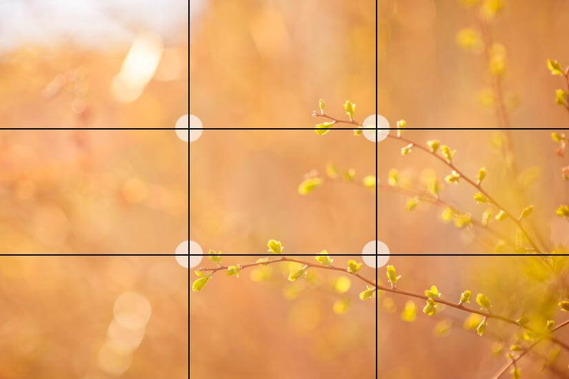
Since the branches are at various heights in this photo, the rule of thirds really came in handy. The top branch falls in the upper right intersection. Your eye starts there and flows to the hotspots intersecting the lower branch.

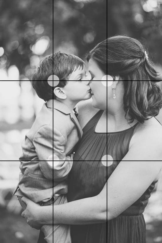
In this shot, the connection and emotion are happening along the top third of the image and near the intersecting points.
If you don’t get your perfect positioning in-camera (and who does), you can also experiment with cropping in post-processing to find the most dynamic composition. Both Lightroom and Photoshop have built-in tools, including a rule of thirds overlay, to help guide you.
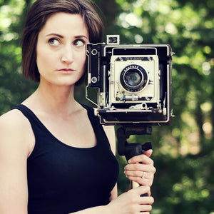
In the top photo below, the subject is in the very center of the image.
As you can see, the bottom photo was cropped to make the subject slightly off-center at the intersecting points of our nine squares diagram, making it a much more dynamic image.

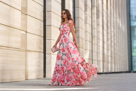
The Rule of Thirds can be used as an excellent guideline for composition, but just like any other rule or guideline, breaking it can make for exciting results in some cases.
Here are a few examples of when breaking the rule of thirds can result in a better photograph:


There are certainly many other times when breaking the rule of thirds can lead to a more striking photo! However, having a firm grasp on this concept and letting it become second nature, will help you experiment and break it more effectively in the long run!
Do you have any questions or comments about the Rule of Thirds? Leave us a comment below - we would LOVE to hear from you! And PLEASE SHARE this post using the social sharing buttons (we really appreciate it)!


Anna Gay is a portrait photographer based in Athens, GA and the author of the dPS ebook The Art of Self-Portraiture. She also designs actions and textures for Photoshop. When she is not shooting or writing, she enjoys spending time with her husband, and their two cats, Elphie and Fat Cat.

Comments